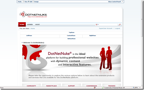
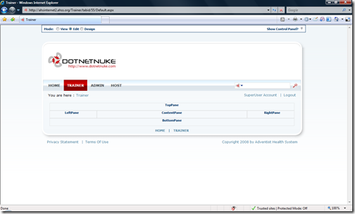
I was pleased to see the first look of the Dotnetnuke 4.9.0 screens. I like it. Its a new skin too and no more blue and gray skin available. It comes with just one skin. Also the skin file has more CSS based (more DIV and less tables). The panes are still defined as tables not sure why but other area of the skin are DIV.
Take a look.


Yes I am glad to see them retire the Blue and Gray skins. I despise them and it makes everyone think DNN is bad based on that first impression. This is much better, but still has further to come. Give up the tables we say!
ReplyDeleteRyan Doom - Web Ascender
Well said. It took us years to prove that we can build a good looking website using Dotnetnuke. Because everyone had the blue skin impression, boxy skin with typical top menu. But once we had www.adventisthealthsystem.com and then www.ctmc.org no one questioned.
ReplyDelete